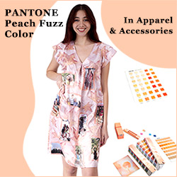
Pantone Color of the Year 2023 is Viva Magenta 18-750
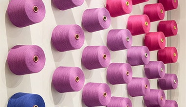
Pantone’s Color of The Year 2023 Viva Magenta 18-750 vibrates with vim and vigor. It is a shade rooted in nature descending from the red family and expressive of a new signal of strength. Viva Magenta is brave and fearless, a pulsating color whose exuberance promotes a joyous and optimistic celebration, writing a new narrative.
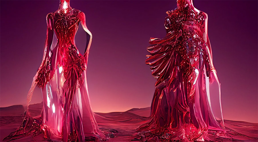
This year’s Color of The Year is powerful and empowering. It is an animated red that revels in pure joy, encouraging experimentation and self-expression without restraint, an electrifying, and a boundless shade that is manifesting as a stand-out statement. PANTONE 18-1750 Viva Magenta welcomes anyone and everyone with the same verve for life and rebellious spirit. It is a color that is audacious, full of wit and inclusive of all.
As a nuanced crimson red tone that presents a balance between warm and cool, PANTONE 18-1750 Viva Magenta is also a hybrid color, one that comfortably straddles the physical and virtual in our multi-dimensional world. It is assertive, but not aggressive, a carmine red that does not boldly dominate but instead takes a “fist in a velvet glove” approach. Exuding dynamism, PANTONE 18-1750 Viva Magenta is a transformative red tone capable of driving design to create a more positive future.
The Meaning Behind Viva Magenta - Color of The Year 2023
As we balance our digital and physical lives, we continue to grow our appreciation for the natural world. The Color of the Year 2023 acknowledges our gravitational pull towards natural colors as movements swell around climate change, sustainability, and land protection.
In this year’s Color of the Year selection process, Pantone observed a heightened appreciation and awareness of nature represented by countless lifestyle trends. We’re incorporating more living things into our homes, such as plants, florals, living walls, and restorative outdoor spaces. We’re finding newfound enjoyment in travel, sports, and outdoor recreation after pausing these activities during the pandemic. We’re more careful to protect our bodies as a result of the public health crises — we look to apply and ingest trusted, life-giving ingredients. All of these lifestyle trends speak to the heartiness of natural forces.
Viva Magenta’s organic origins hail from the cochineal beetle. This insect produces carmine dye, one of the most precious, strongest, and brightest of the natural dye family. The red tone of Viva Magenta connects us to original matter, imbibing us with a primordial signal of strength.
The Color of the Year 2023 merges the richness, warmth, and strength of natural matters with the rich, open horizons of the digital world. The result is a shade of red that expands our horizons of authenticity. The metaverse creates new opportunities for us to express ourselves, and the raw fortitude of Viva Magenta inspires us to do so with confidence and bravery.
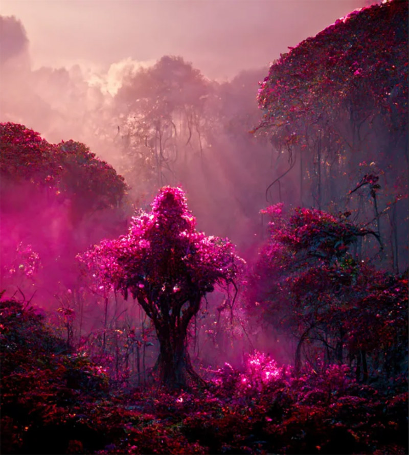
Viva Magenta Color Psychology
Reds are power colors that celebrate life. As a bright, crimson red, Viva Magenta balances boldness with a feeling of fun. This dynamic mix exudes rebellion, but not at the expense of softness. It embodies an expression of fierce grace, inspiring us to show up with confidence and humanity. The digital space has accelerated globalization, and as a result, we are more deeply connected to each other than ever before. We can never fully understand what lies beneath the surface of the friends and strangers we meet, but we can always work to deepen our empathy. The Color of the Year 2023 speaks to our desire to take on new challenges and try the unconventional while meeting others with compassion.
What distinguishes this year’s Color of the Year from last year’s — PANTONE 17-3938 Very Peri, which also married the technical with nature — is Viva Magenta’s ability to answer our collective need for strength.
Viva Magenta offers us the assurance and motivation we need to weather long-term disruptive events. Three years deep into a pandemic, facing a war, an unstable economy, social unrest, supply chain breakdowns, and mounting climate change, we need to heal. And still, we need to find the motivation to continue. Here, Viva Magenta cloaks us in both power and grace, and sends us out into the world with the verve we’ve yearned for.

How to Use Viva Magenta
How to Wear Viva Magenta
Feeling powerful? Wear the Color of the Year as a full-on statement. Need to wake up a quieter outfit? Viva Magenta works radiantly as an accessory — pair it with pale grays, blues, or pastels. Want to jump on the monochromatic trend? Try it with other pinks and command the room.
Because Viva Magenta is a red that strikes a balance between warm and cool, it’s not too harsh for the body. Instead it brings a fun, celebratory element. In the beauty industry, Pantone sees the Color of the Year worn in hair, especially on tips, a bold look that can transform hair into an accessory. Viva Magenta also shines on lips, cheeks, and nails. This versatile shade is universally flattering across ages, genders, and skin tones.
Viva Magenta in Home and Interiors
Daring designers can harness the full power of the Color of the Year as a velvet couch or lacquered wall. Those who desire a more neutral home can use it as a pop of color. As a sculptural Murano glass lighting fixture or striking ikebana floral arrangement punctuating an all-neutral dining room, or a glowing abstract canvas or NFT projection in a white entry-way, Viva Magenta packs a lot of drama in a small dose.
Viva Magenta in Graphic Design
Today’s consumers spend large portions of their days looking at a screen where the visuals tend towards pale and neutral. Designers looking for a color that cuts through this space will find the Color of the Year 2023 a captivating solution. A brand using Viva Magenta expresses that it’s fearless, engaging, and that looks at the world unconventionally to bring about new solutions.
Viva Magenta in Packaging and Plastics
Brands wanting to appear animated and passionate can use Viva Magenta to elicit a strong consumer reaction. Because reds are advancing colors, they draw the eye and muscle out the colors surrounding them. Whether consumers are scrolling on their phones or browsing the aisles, tapping into the Color of the Year 2023 will ensure you stand out.
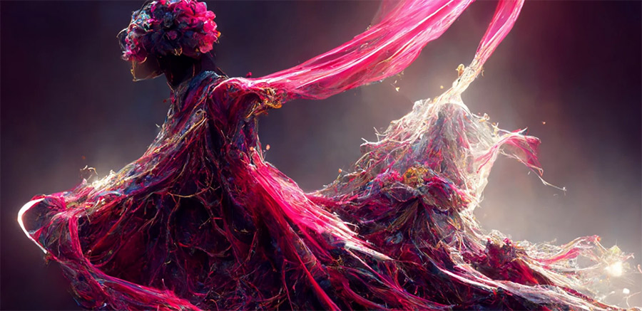
How Does Pantone Pick the Color of the Year? An Interview with Laurie Pressman, Vice President of the Pantone Color Institute
Laurie, talk about why and how this process began. When did Pantone Color of the Year start?
The Pantone Color Institute originally created the Pantone Color of the Year educational program in 1999 to engage the design community and color enthusiasts around the world in a conversation around color. We wanted to draw attention to the relationship between culture and color. We wanted to highlight to our audience how what is taking place in our global culture is expressed and reflected through the language of color. This thought process rings just as true today just as it did back in 1999. That’s one of the major reasons why, each year, so many around the world look forward to our Pantone Color of the Year announcement.
Who decides Pantone Color of the Year?
To arrive at the selection each year, this global team of color experts at the Pantone Color Institute comb the world looking for new color influences. This can include the entertainment industry and films in production, traveling art collections and new artists, fashion, all areas of design, aspirational travel destinations, new lifestyles, playstyles or enjoyable escapes as well as socio-economic conditions. Influences may also stem from new technologies, materials, textures and effects that impact color, relevant social media platforms and even upcoming sporting events that capture worldwide attention.
Anything and everything taking place in our culture during the year can influence our Pantone Color of the Year selections for the upcoming year with each source carrying a different weight from year to year, depending on what is taking place in our culture at that time. For example, if you look back to 15 years ago, technology would have played an infinitesimal role. Today that is no longer the case. Gaming, social media, AR and physical design itself are all influenced by our technology and the colors we can access in the digital environment.
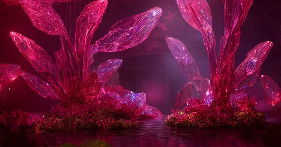
How does the selection process work? How does Pantone decide the Color of the Year every year?
The Pantone Color of the Year selection process entails thoughtful consideration and trend analysis. It is a culmination of the macro-level color trend forecasting and research that the global team involved with the Pantone Color Institute conducts year-round that informs this selection, as well as the colors that get included into our color trend forecasting products.
We approach our color selection in a very pure way. No one on our global team comes to any Pantone Color of the Year discussion with a commercial agenda or inserts their personal preferences. Instead, we each approach our Pantone Color of the Year color selection in a very pure way. As we like to say, “we love all of our colors equally.”
There’s also a misconception that we gather a bunch of color influencers in a room one day and emerge with the decision. Instead, as many of our Pantone Color Institute team members own their own design studios, contribute to key influential global trend forecasts, work with clients prescribing color choices for product or brand visual identity, and even teach classes on color, their daily conversations are rooted in color and design, including material and surface finish. As a result, conversations relating to our Pantone Color of the Year selection do not take place in one isolated meeting at a specific time of year. It is one long, continuously flowing conversation among a group of color-attuned people.
Our Pantone Color Institute team members come from a wide range of design, cultural and geographical backgrounds. The commonality that brings them together is their expertise in color and design, and their ability to see the world through the lens of color. That’s why I liken them to being color anthropologists. They have this intuitive ability to connect all that is taking place in the world and translate it into the language of color.
What’s especially fascinating to me about the Pantone Color of the Year selection process is that although our Pantone Color Institute members reside in disparate locations and are involved in differing areas of design, we are always able to come to a consensus. Sure, there are different perspectives that come up and we carefully look at them all, but because the Pantone Color of the Year reflects what is taking place in our global culture at that moment in time, many of our observations are quite similar. We discuss our color psychology and color trend research looking to connect the mood of the global zeitgeist with the corresponding color family. Fom there, we drill down further to identify the exact right shade. And as we did for the first time for our Pantone Color of the Year selection in 2022, PANTONE 17-3938 Very Peri, if we do not have the exact right color to convey the message, we will create it.
The name of the color also needs to help tell the story. Names immediately conjure up an image and a feeling. We want to make sure that the name of our Pantone Color of the Year resonates and can easily and intuitively convey the message we are looking to send.
What does the selection of the Pantone Color of the Year represent?
The color we select to be our Pantone Color of the Year is bigger than one region or one sector of design. It is a color we see crossing all areas of design; a color that serves as an expression of a mood and an attitude on the part of the consumers, a color that will resonate around the world, a color that reflects what people are looking for, a color that can hope to answer what they feel they need.
That’s the difference between a more short-lived fad and a lifestyle trend. Pantone Color of the Year is reflective of a lifestyle trend. It’s about what’s happening in the zeitgeist at a macro level. It's not going to represent a singular trend that you can only find in the US or only find in Asia. It’s global.
It is critical that we make sure that the color really reflects what's taking place in the global culture at that moment in time. Pantone Color of the Year isn’t about what the color is going to represent three years from now, or what it represented last year. It is about what we see for the immediate upcoming year.
The emotional aspect of color is also a large aspect of our decision making. We want to ensure that the colors we select reflect what is taking place in our global culture at a specific moment in time. With color and context so intertwined, there really are reasons why a color family or individual color comes into prominence when it does. For the most part, the popularity of a color is symbolic of the age we live in. So, while each year is unique, and we look at each year separately, we also do look back to where we have been since we began this program in 1999.
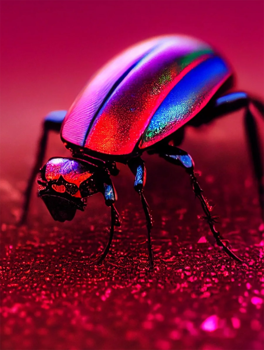
Why does Pantone pick the Color of the Year? In other words, what makes the Pantone Color Institute the global authority on color?
Pantone is in the business of color. Since 1963, Pantone has provided color solutions for all our client’s color needs. Today Pantone’s color language is used by designers worldwide to access color trends, communicate color choices, and control consistency of color across every imaginable surface, texture, material, and finish.
Founded in 1985, the Pantone Color Institute educates, inspires, and promotes fluency in the language of color. Executive Director Leatrice Eiseman, who helped to start the Pantone Color Institute, has a background in color, design and psychology. The ongoing color preference study research which she conducts through the Pantone Color Institute serves as the foundation for who we are and all that we do.
Why is Pantone Color of the Year important? When the program is successful, what happens to the world?
It’s important to remember that the goal of the program isn’t to push a certain color, although we do see that colors named as Pantone Color of the Year increase in popularity. Afterbeing integrated into the cultural mindset, they sometimes become even more influential the following year. The goal of the program is to help companies and consumers better understand the power color can have. We want to teach them how to leverage color’s power and expressiveness to influence perception — whether it be to create a more successful design strategy that will increase consumer engagement, or to use it to better showcase your own personal identity.
For companies, Pantone Color of the Year demonstrates that color is a major part of a consumer’s decision to buy something or not. For consumers, it makes them conscious of the impression they can make through color. On any given day, the colors you choose to wear are affected by your mood and your desire for how you want others to perceive you. Color is an important part of the message you send to the world.
Color is the most important powerful communication tool. It is the first thing we see and the first thing we connect to. It is a visual language we all understand, one whose message crosses genders, generations, and geographies. Learning more about the unique meanings particular colors give voice to helps us to be a more expressive, closely connected society, one that provides people with a more holistic understanding of their peers and communities alike. As a globally recognized visual language, color can say what words cannot.
Hits: 15344 | Leave a comment
Tags:Pantone, color of the year, Viva Magenta, 2023


